Process · Strategy6 min
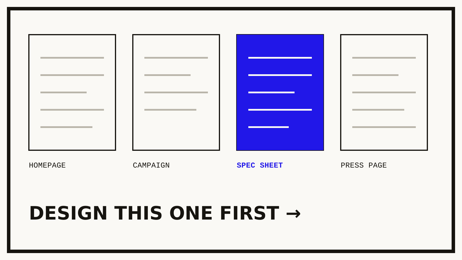
Why we design the boring pages first
Homepages win awards. Specification sheets win contracts. A defence of starting where nobody is looking.
Loading —
Our house style gets called brutalist. Here's what that word means when there's revenue attached to it.
Weronika Zając · · 7 min · Design · Strategy
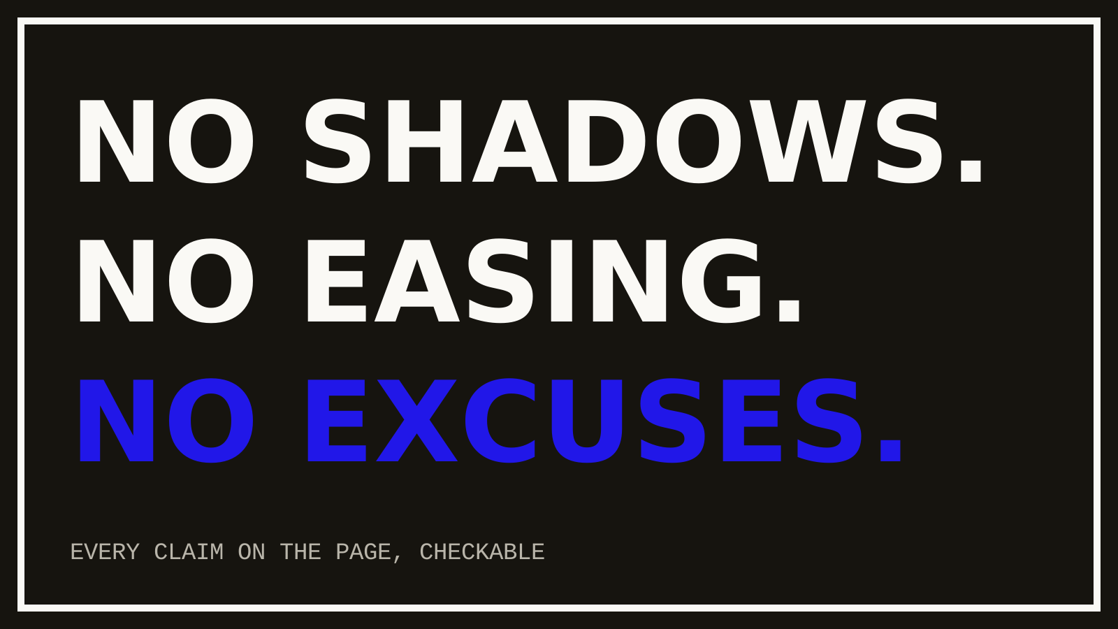
When people call our work brutalist they usually mean the surface: heavy type, hard corners, black on unbleached white, no shadows pretending the screen has depth. Fine. But the surface is downstream of a commercial argument, and the argument is the part worth writing down.
Every gradient, drop shadow, and eased animation on a commercial site is asserting something — friendliness, innovation, polish. Assertions invite scrutiny. A loudspeaker brand wrapped in lifestyle photography is claiming a feeling; the moment a measurement forum pulls up the frequency response, the feeling is on trial. Moor Audio launched with the graph on the box instead. Nothing to defend, because nothing was claimed that wasn't measured.
That's what the bluntness buys: a brand whose visual language makes only checkable claims. Numbers at poster scale. Documents presented as documents. Buttons that look like what they do. For companies selling to engineers, procurement panels, and researchers, this isn't an aesthetic preference — it's rhetoric matched to the audience's epistemics.
Brutalism is cheap to imitate and expensive to sustain. Anyone can set a headline in 900 weight. The discipline is in what you refuse afterwards: no soft state creeping into hover effects, no radius sneaking onto the cards, no easing curve smuggled in because a transition felt abrupt. Felt abrupt to whom? The user got their answer a frame sooner.
We keep a short list of things the style is never allowed to cost: legibility, contrast, keyboard access, reading comfort at phone width. Inside those constraints, blunt. Outside them, never. That's the whole manifesto, and it fits on a sticky note — in 900 weight, obviously.
Homepages win awards. Specification sheets win contracts. A defence of starting where nobody is looking.
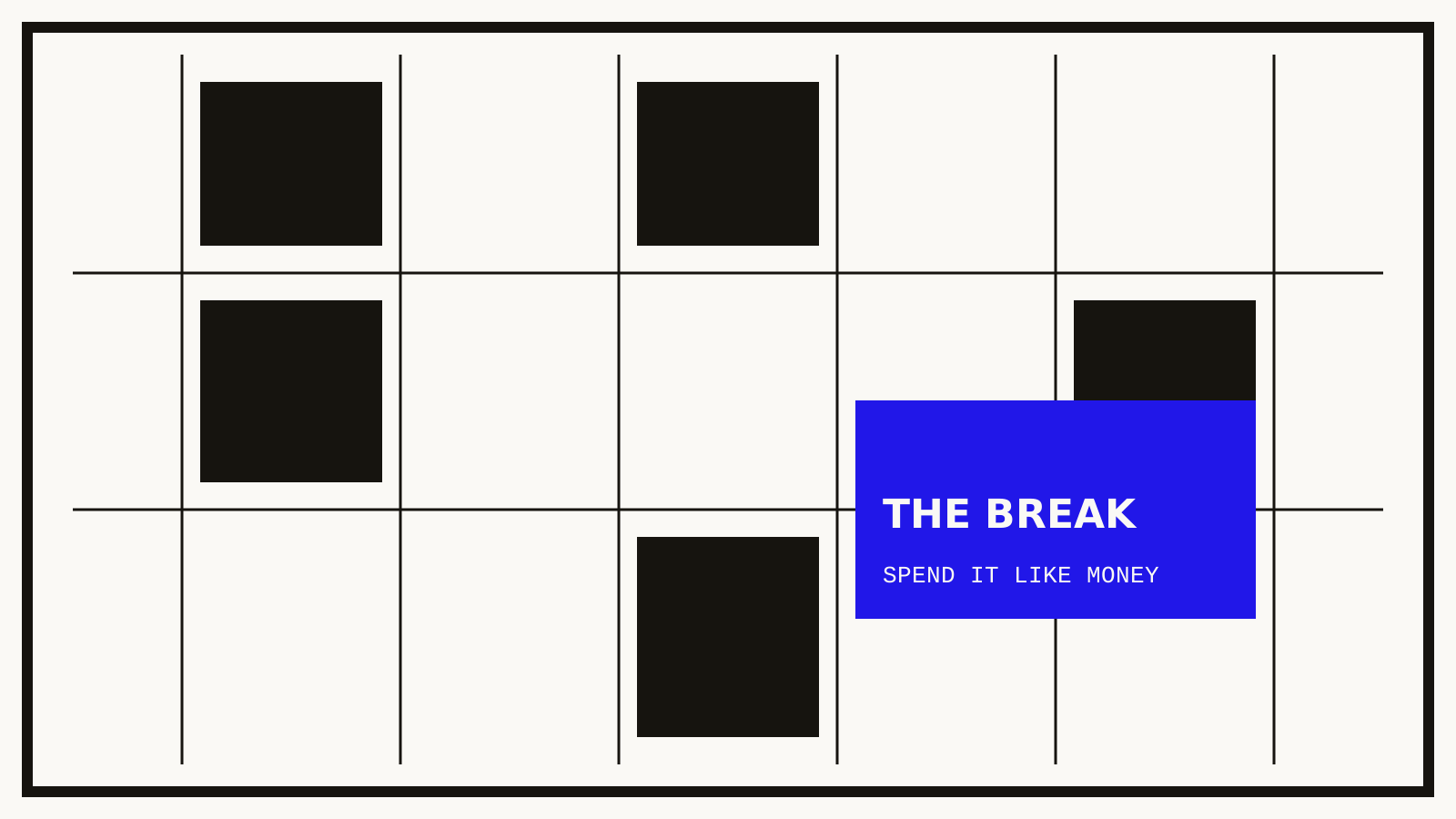
Visible structure isn't an aesthetic tic. It's a contract with the reader about where things will be.
Eight to ten projects a year. Currently scheduling work for next quarter.
Start something →newwork@foundrynorth.example · +44 161 496 0233